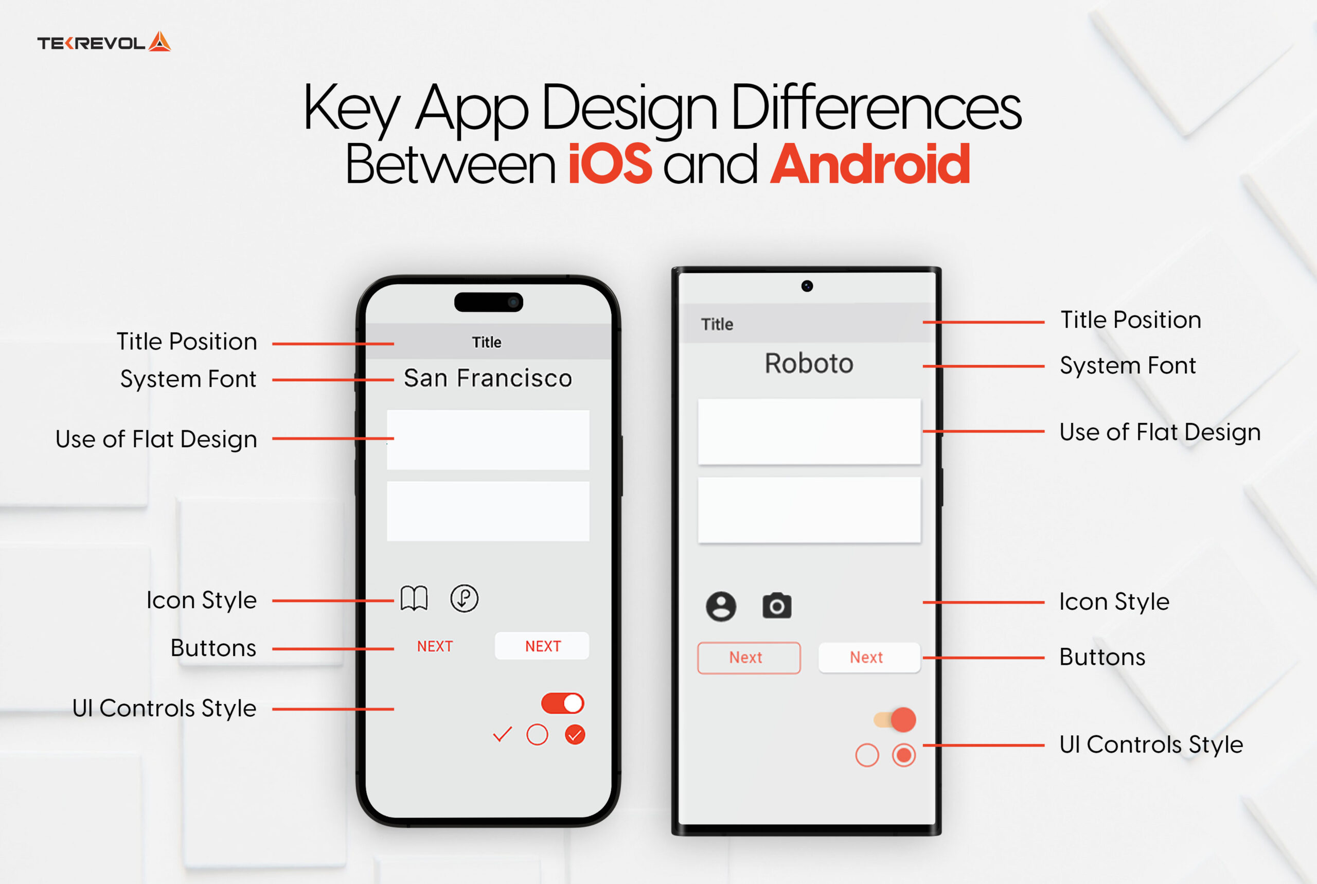
Key App Design Differences Between iOS and Android
The design differences between iOS and Android apps show up in 11 areas: navigation patterns, back navigation, buttons, icons, screen resolutions, typography, search, controls and pickers, cards and depth, alerts, and motion. Many of these map to the broader mobile app design patterns users encounter daily;
Here’s each difference, updated for the current iOS design language vs Android’s Material You evolution:
Your mobile apps will be used by real humans, so you have to design them with a keen eye on ease of use and experience. When designing mobile applications, it’s crucial to understand the distinct navigation styles of Android and iOS platforms.
These differences significantly impact user experience and should guide your design decisions.
1. Top-of-Screen Navigation
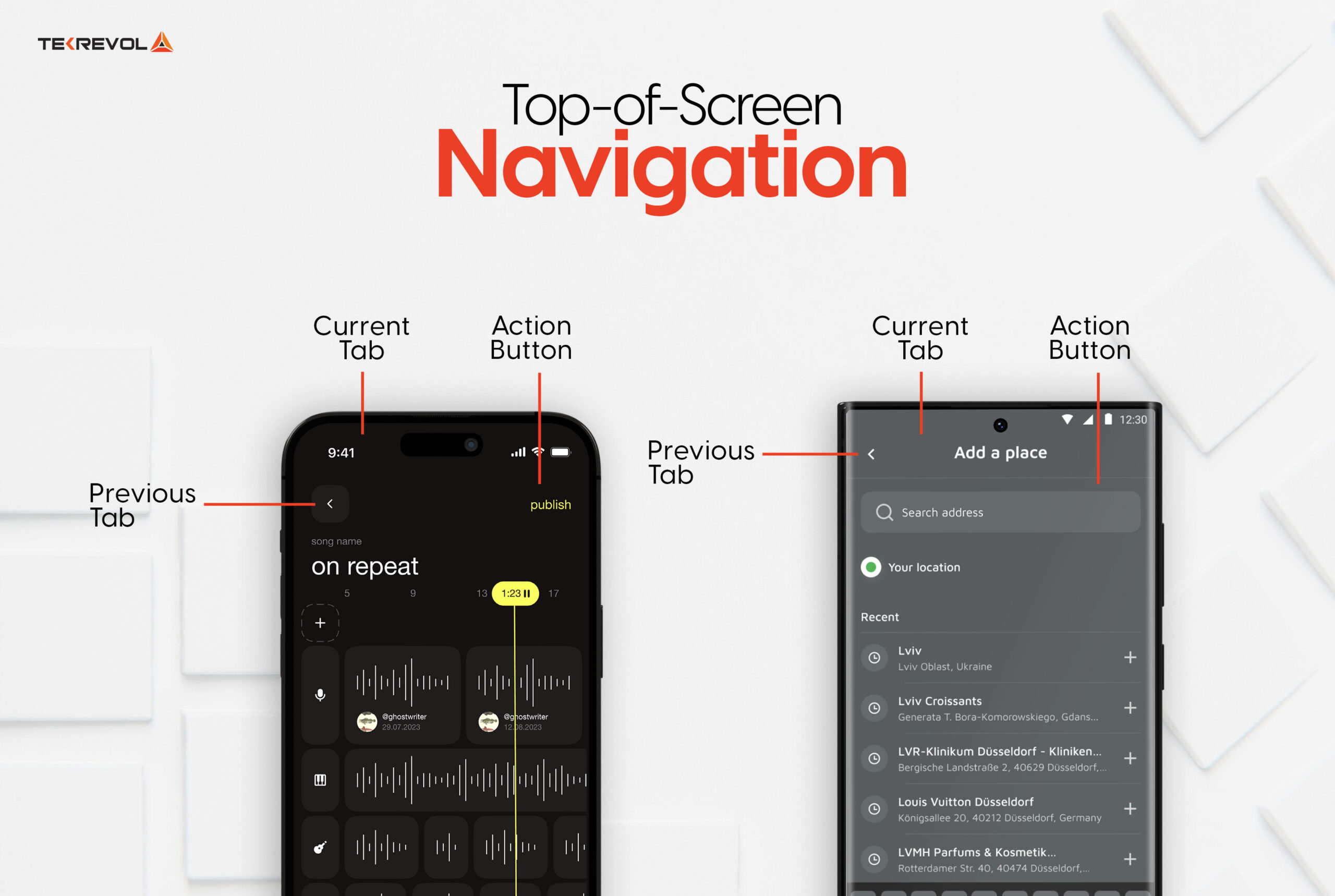
- Android: Titles are typically left-aligned, with action items (such as search or settings) placed on the right side of the top bar.
- iOS: iOS centers titles (or uses large leading titles) in a navigation bar that now takes on Liquid Glass translucency.
2. Primary Navigation Patterns
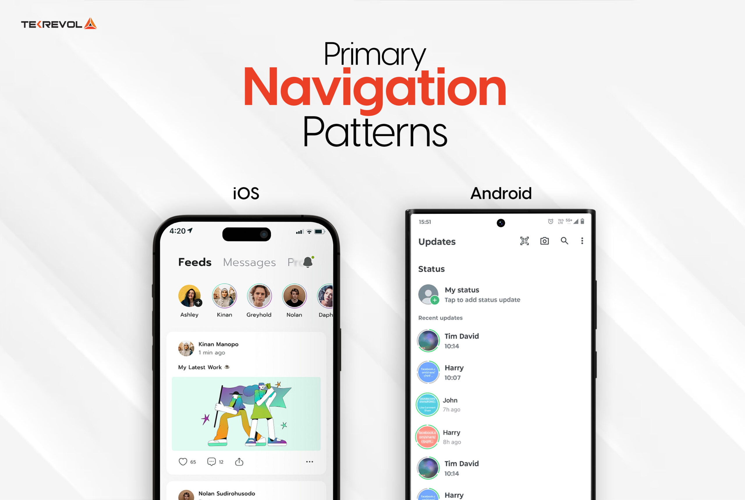
- Android: Bottom navigation bars have replaced the hamburger menu as the Material-recommended default for 3–5 destinations; navigation drawers survive only for large or tablet layouts.
- iOS: The tab bar remains standard, and in iOS 26 it shrinks and floats as the user scrolls, returning on scroll-up.
3. Secondary Navigation Options
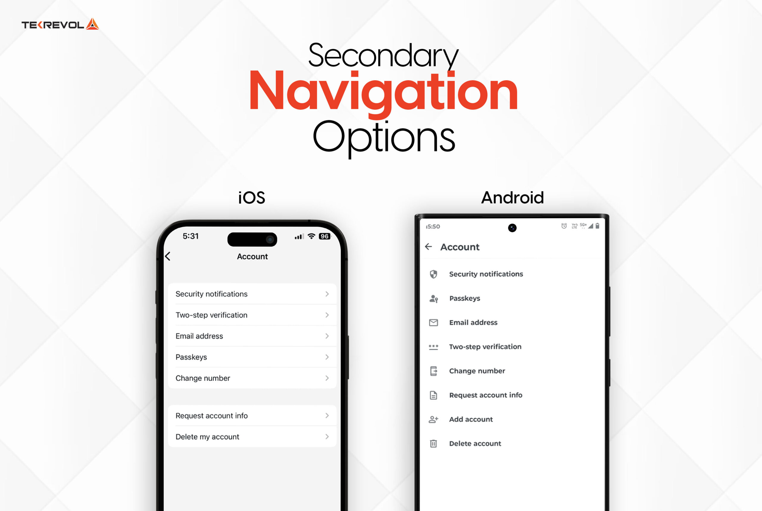
- Android: Features a navigation drawer that slides in from the left, offering access to additional app sections.
- iOS: Often uses nested views or additional tabs to present secondary navigation choices.
4. Back Navigation Methods
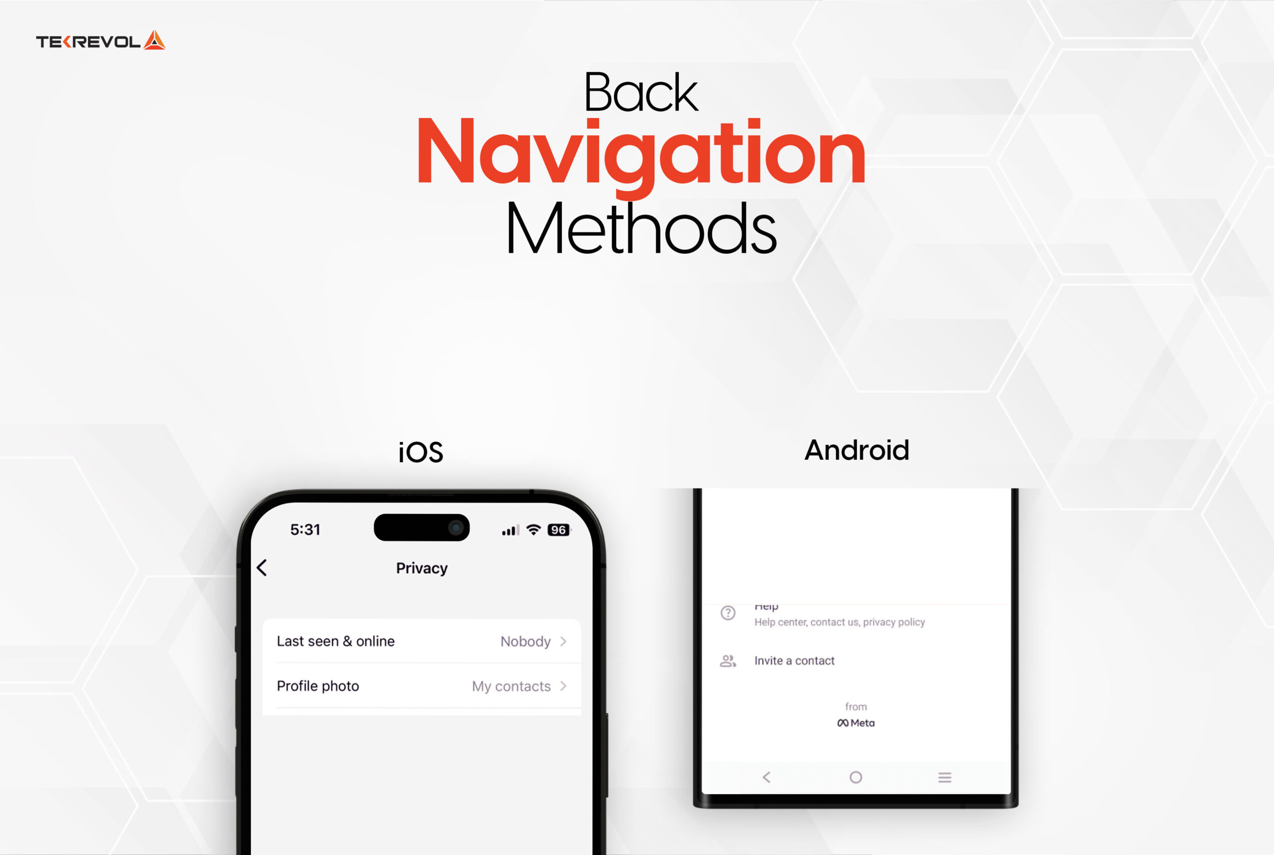
- Android: System-level back (the predictive back gesture) now previews the destination screen before you commit.
- iOS: Offers a back button in the top-left corner of the screen and supports swipe gestures from the left edge to navigate back.
5. Button Design Differences
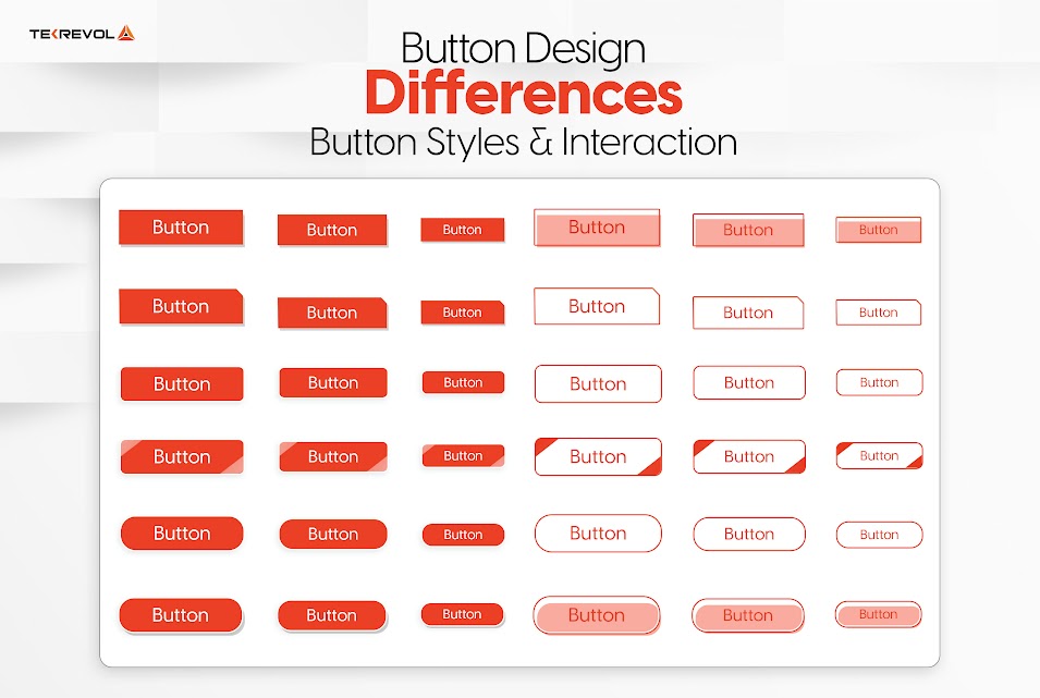
Button Styles and Interaction
- Android: Buttons often have a raised appearance with shadows, aligning with Material Design principles to indicate interactivity.
- iOS: Prefers flat buttons with minimal styling, focusing on simplicity and content prominence.
Floating Action Button (FAB) Usage
- Android: Commonly uses a Floating Action Button (FAB) for primary actions, positioned prominently on the screen.
- iOS: Does not typically incorporate FABs; primary actions are integrated into the navigation bar or toolbar.
6. Visual Elements in App Design
Iconography and Screen Resolution
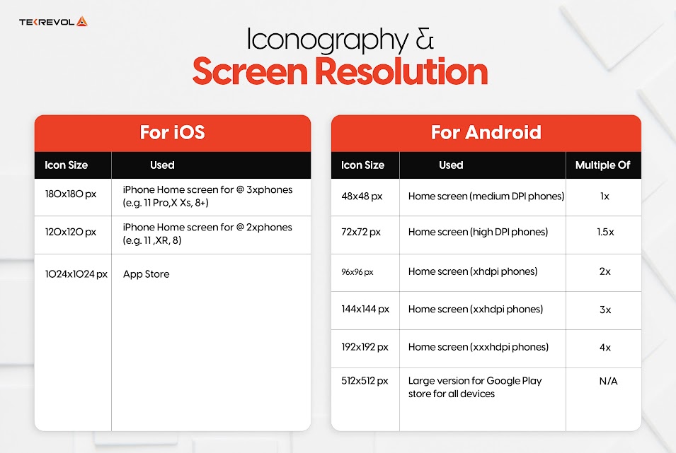
Icons
- Android
- Material Design guidelines encourage a consistent style across applications.
- Icons are customizable and scalable to fit various screen resolutions.
- Developers are advised to provide multiple sizes to ensure clarity on all devices.
- iOS
- Human Interface Guidelines (HIG) emphasize simplicity and alignment with the iOS aesthetic.
- Icons are designed for elegance and high clarity, especially on Retina displays.
- Apple encourages a uniform style that enhances user recognition.
Screen Resolution & Device Diversity
- Android: Thousands of screen configurations, from budget phones to foldables that change aspect ratio mid-session. Layouts must be genuinely adaptive, and assets must scale across densities.
- iOS: A small, predictable set of device sizes controlled by one manufacturer — dramatically less layout and asset work.
PROOF POINT
When we built
Tamreeni, a fitness app for a broad mixed-device audience, adaptive Material layouts across every device class as the strategy. Designing for Android’s diversity from day one is a major reason the app became one of TekRevol’s most successful Android projects.
7. Typography Choices
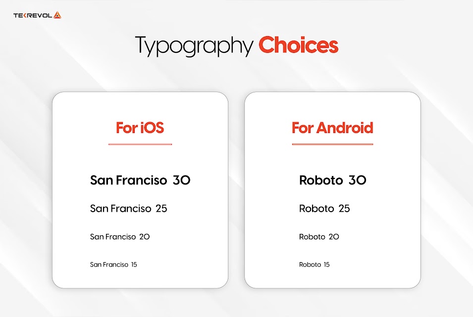
Font Choices
- Android:
- Uses Roboto (with Google Sans on Pixel devices) as the standard font for a clean and modern look.
- Encourages custom fonts for unique branding, provided readability is maintained.
- iOS:
- Relies on San Francisco for optimal legibility and simplicity.
- Incorporates dynamic type to scale text based on user preferences for accessibility.
Readability and Engagement
- Android: Roboto’s flexibility ensures readability across diverse screen sizes.
- iOS: San Francisco enhances the reading experience with a user-friendly, scalable design.
8. Control Design and User Interaction
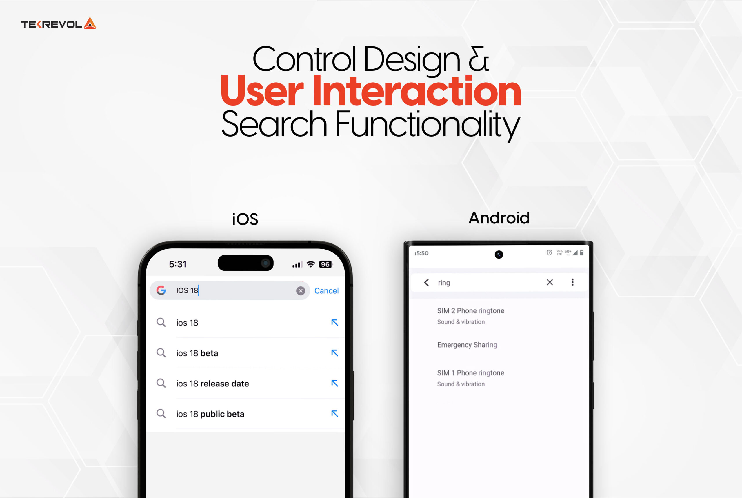
Search Functionality
Placement and Design
- Android:
- Search bars are typically placed at the top of the screen for easy access.
- Accompanied by a magnifying glass icon for clarity.
- iOS:
- Search bars are often integrated into the navigation bar for a seamless experience.
- Maintains aesthetic flow while ensuring usability.
Primary Call-to-Action Buttons
Design and Placement
- Android:
- Utilizes Floating Action Buttons (FABs) for primary actions.
- Positioned at the bottom right, with drop shadows for prominence.
- iOS:
- Features UIBarButtonItem for primary actions, placed in toolbars or navigation bars.
- Styled with titles or images for intuitive navigation.
User Interaction
- Android: FABs encourage interaction by being visually distinct and accessible.
- iOS: Action buttons are integrated seamlessly into the interface, guiding users effectively.
Selection Controls
Design and Functionality
- Android:
- Employs dropdown menus for compact and familiar selection options.
- Efficient for presenting multiple choices without overwhelming the screen.
- iOS:
- Uses picker controls that allow users to scroll through options interactively.
- Commonly applied for date and time selection, with distinct day, month, and year fields.
9. Card Designs in Mobile Apps
Layouts and Features
Card designs serve as a functional and visually appealing tool for organizing content in mobile applications, offering clarity and usability.
Android
- Material Design cards are defined by their rectangular shapes with rounded corners and noticeable shadows.
- These shadows create depth, making cards distinct from the background.
- Common elements in Android cards include images, text, and buttons, offering flexibility for presenting content.
iOS
- iOS cards lean towards a minimalistic design, often without pronounced shadows.
- Rounded corners and clean layouts with ample whitespace characterize Apple’s card style.
- The emphasis on simplicity ensures the content remains the focal point, enhancing user engagement.
10. UX Design Considerations
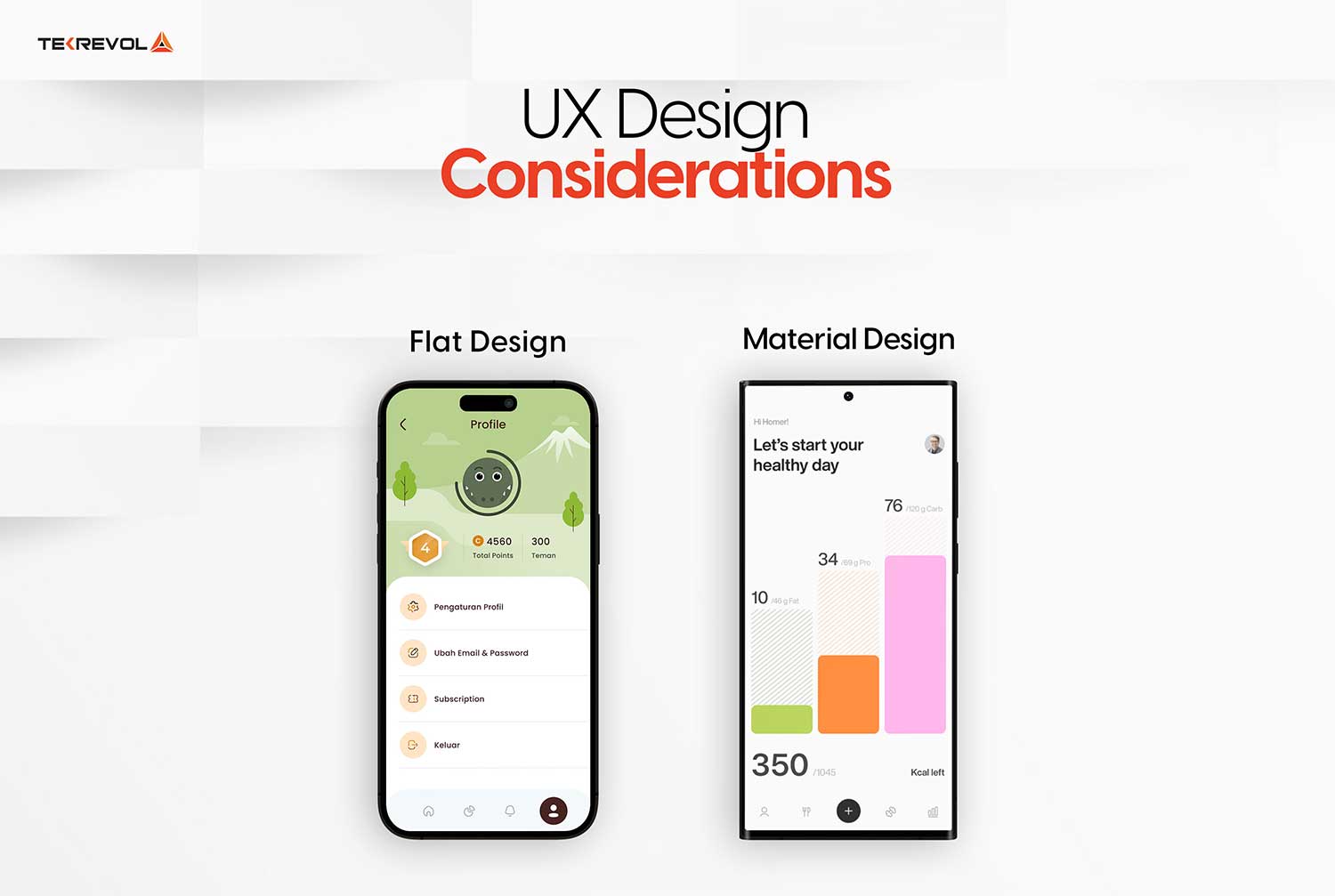
User Experience Differences
Design philosophies between Android and iOS significantly influence the user experience.
- Android: Offers a customizable design environment for unique app experiences. This flexibility can result in variations between apps, but adherence to Material Design principles provides consistency.
- iOS: Prioritizes uniformity and predictability by adhering to strict Human Interface Guidelines. This consistency enhances user comfort, reducing the learning curve and creating a cohesive experience across apps.
Content Scrolling Techniques
Scrolling mechanisms are integral to how users interact with content on Android and iOS platforms.
- Android: Vertical scrolling with features like infinite scrolling or pagination is common. Scrollbars are visible during interactions, providing users with feedback on their position within the content.
- iOS: Momentum scrolling is a hallmark of iOS, offering smooth transitions and an intuitive feel. Scrollbars often appear momentarily, maintaining a clean interface while aiding navigation.
11. Alert Designs
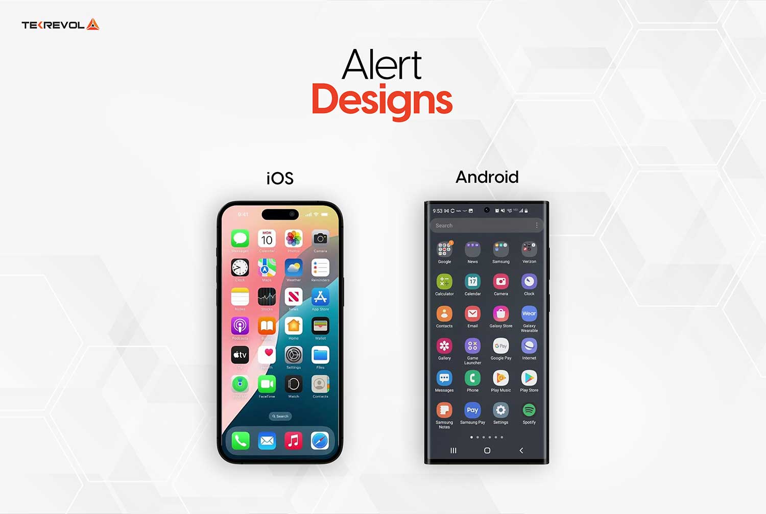
Alerts provide vital user feedback and guide decision-making in mobile apps.
- Android: Alerts in Android apps are prominent, with clear titles, concise messages, and actionable buttons. Placement at the bottom ensures ease of access, while the use of colors and icons emphasizes urgency or importance.
- iOS: iOS alerts focus on clarity and simplicity. Messages are brief, and buttons are positioned for intuitive access. Subtle colors align with the app’s aesthetic, ensuring that alerts are noticeable without disrupting the user experience.
Platform-Specific Design Components
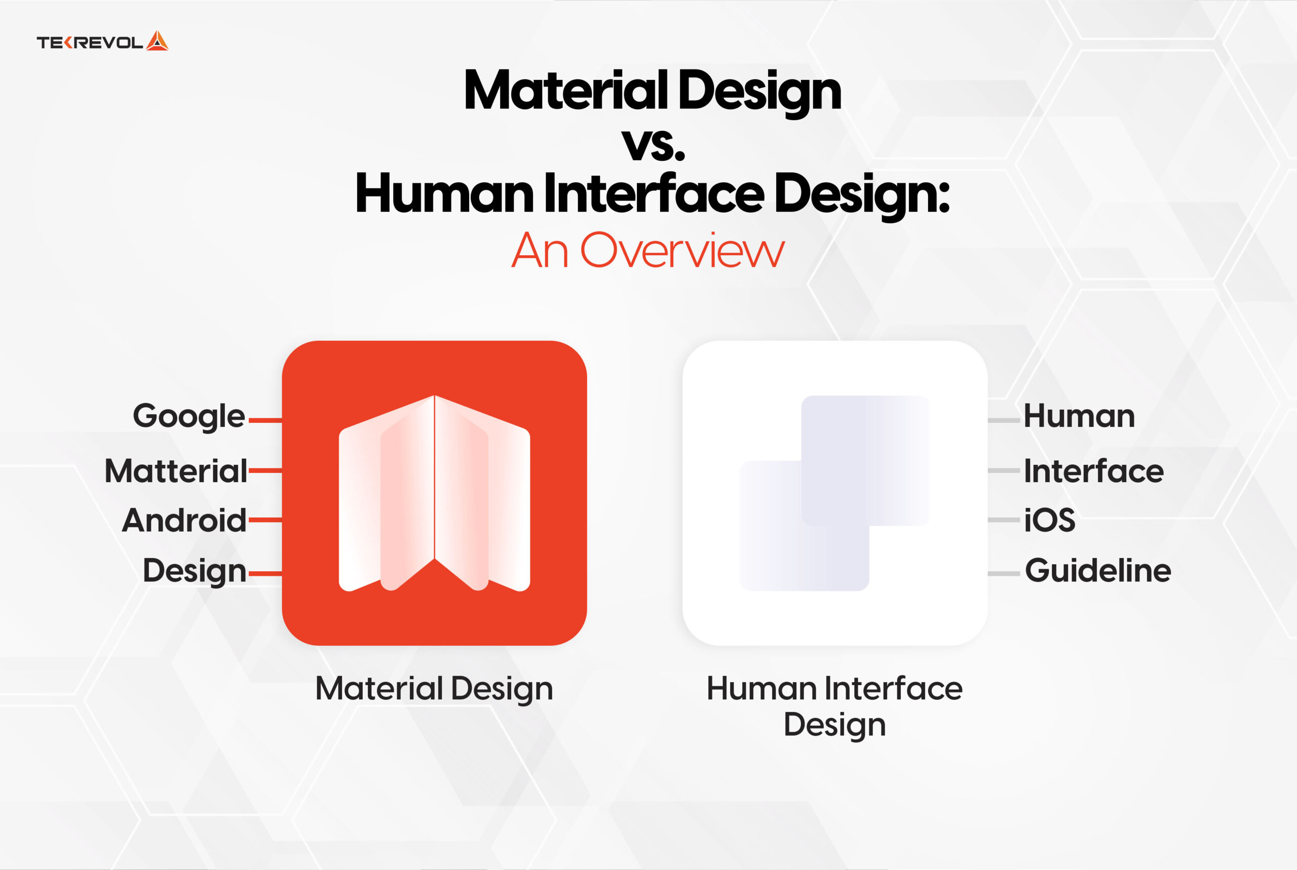
Beyond shared patterns, each platform owns components that the other simply doesn’t have. Android offers more customization through widgets, notifications, launchers, and system flexibility. While iOS creates stronger consistency through gestures, Apple services, and strict native components.
Android
- Widgets: Android’s home-screen widgets remain the most flexible in mobile: freely resizable, deeply interactive, and placeable almost anywhere.
- Notifications: Android notifications are rich and interactive, with expandable views, direct reply, and grouped channels that users control per category. Android 16 added live, progress-style notifications for ongoing activities like deliveries and rides, so notification design is now genuinely part of your app’s UI, not an afterthought.
- System integrations: Android integrates deeply with device capabilities and Google’s ecosystem, now fronted by Gemini, which has replaced Google Assistant as the platform’s AI layer. Multi-device synchronization, casting, and cross-app intents let well-designed Android apps extend beyond their own screens.
iOS
- Gestures: iOS navigation leans heavily on swiping, pinching, long-pressing, and edge-swiping back. iOS 26’s fluid glass transitions make gesture responsiveness even more visible.
- Haptic Touch: Haptic Touch (the long-press system that succeeded the discontinued 3D Touch hardware) adds a layer of depth to interactions: contextual menus, quick actions from the home screen icon, and link previews.
- System integrations: iOS promotes a unified ecosystem: Siri and App Intents (now extended by Apple Intelligence), iCloud sync, Apple Pay, and Continuity across iPhone, iPad, and Mac. Apps that adopt these integrations inherit trust and convenience that users already rely on.
The Design Implication
These components aren’t optional extras. They’re where each platform’s users judge. Budgeting design time for widgets and notifications on Android and for gestures and system integrations on iOS consistently pays back in retention.
How Design Differences Impact Android and iOS App Development Cost
Design differences drive cost in opposite directions on each platform.
Android’s device diversity means more layout adaptation and more extensive testing. It raises QA, maintenance, and overall Android app development costs.
iOS’s stringent design guidelines demand higher upfront investment in UI design, but its limited device set keeps testing lean.
Effectively budgeting for app development requires understanding the costs associated with each platform’s design demands. Here’s a comparative breakdown:
| Cost Component |
Android App Development Cost |
iOS App Development Cost |
| Design Research & Prototyping |
$2,000 – $5,000 |
$3,000 – $6,000 |
| User Interface Design |
$3,000 – $7,000 |
$4,000 – $8,000 |
| Development (per hour) |
$50 – $150 |
$70 – $200 |
| Testing & Quality Assurance |
$1,000 – $3,000 |
$1,500 – $4,000 |
| Maintenance (annual) |
$5,000 – $15,000 |
$6,000 – $18,000 |
Note: costs vary based on app complexity, team expertise, and specific project requirements.
Three design-driven cost realities worth knowing.
- Android’s fragmentation, including foldables that must be tested: folded, unfolded, and in split-screen, can add 30–40% to QA time for the same feature set.
- iOS’s design bar inflates the initial build rather than maintenance, as Apple’s review process rejects apps that do not feel native.
- Supporting both new design languages properly (Liquid Glass and Material 3 Expressive) is now a real line item, because each platform’s system apps reset user expectations annually.
Want actual number instead of a range?
Share your feature list and target platform, and we'll return a line-item design and development estimate within two business days.
Get Free App Development Estimate
Business Implications of Design Choices
The difference between iOS and Android design not only influences how users interact with your application.</span> They also affect brand perception, development effort, QA scope, platform strategy, and conversion performance.
iOS-led design suits premium, consistency-minded markets like the US. Android-led design suits diverse, personalization-minded global markets, and the wrong match costs downloads on day one.
Choosing Between Platforms for Development
- Android App Development: Android’s open-source nature offers extensive customization options, allowing businesses to create unique app experiences. However, the platform’s diverse range of devices and screen sizes can increase the complexity of design and testing efforts.
- iOS App Development: The applications designed are based on Apple’s Human Interface Guidelines, which means applications are consistent across all devices. So, businesses can focus on providing a premium, seamless application experience.
Your platform design choice affects four business outcomes:
Audience Alignment
Broadly, your target audience divides into two camps with distinct design preferences.
- iOS-heavy audiences, roughly 59–60% of the US market, expect Apple-grade consistency and polish.
- Android-heavy audiences, which dominate globally and across emerging markets, span enormous device diversity and expect personalization. Our Android vs iOS statistics guide breaks these audiences down by region, income, and demographic.
Brand Perception
Users judge quality through design before they experience a single feature. An app that follows its platform’s conventions reads as trustworthy; one that ports the other platform’s UI reads as an afterthought, and reviews say so publicly.
Retention
Design conventions are learned behavior, and friction compounds. A misplaced back action or foreign picker adds hesitation to every session. That hesitation shows up directly in retention curves, which is why app UX design decisions deserve the same rigor as feature decisions.
Store Approval and Featuring
Apple’s human review actively rejects apps that feel un-native, while both stores’ editorial teams feature apps that showcase the current design language. Adopting Liquid Glass and Material 3 Expressive early isn’t vanity, it’s distribution.
Understanding the iOS and Android differences in design principles is crucial for aligning your app with your business goals. Choose a platform that resonates with your target audience while meeting your technical and branding needs.
Why Choose TekRevol for Android and iOS App Design & Development
At TekRevol, we have 10 years of experience in mobile app development, completing more than 800 projects across 11 sectors.
Our team of experts is well-versed in both Android and iOS platforms, ensuring
- User-Centric Design: Creating intuitive interfaces that resonate with your audience.
- Scalable Solutions: Developing apps that grow with your business.
- Timely Delivery: Ensuring your app reaches the market efficiently.
Whether you need a custom Android platform or iOS app, we design platform-native UI (Liquid Glass on iOS and Material 3 Expressive on Android). Our commitment to innovation and excellence has made us a trusted partner for businesses looking to make their mark in the mobile space.
Want actual number instead of a range?
Our mobile architect will map your audience, recommend a platform-design approach, and give you a realistic budget and timeline.
Schedule a Strategy Session
Wrap Up!
Getting started with mobile app development requires a clear understanding of the design differences between Android and iOS.
Android emphasizes customization, adaptability, and expressive personalization across an enormous range of devices. iOS prioritizes consistency, content-first minimalism, and the new material physics of Liquid Glass.
In 2026, with both platforms shipping their boldest design languages in a decade, the gap between a native-feeling app and a ported one has never been more visible to users and to the app stores alike.
Understanding these Android vs iOS design nuances helps businesses align their design choices with their target audience’s preferences, ensuring a higher likelihood of success.
At TekRevol, we specialize in crafting custom mobile applications tailored to your business needs. Contact us today to learn more and start your app development journey!