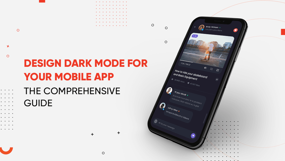
Dark mode isn’t just a design trend; it’s a user expectation. With 82% of smartphone users now preferring dark interfaces over light ones, integrating dark mode has become a critical part of modern UX design.
It’s more than just aesthetics. From reducing eye strain and saving battery on OLED screens to enhancing visual focus at night, dark mode has proven benefits that directly impact user engagement and satisfaction. After rolling out dark interfaces, major platforms like Instagram, YouTube, and Slack saw increased user retention.
So, how do you design an effective dark mode for mobile apps in 2025? This guide breaks it down step by step, covering key principles, real-world design tips, and implementation best practices.
Why Should You Design Dark Mode for Your App?
Designing dark mode for your mobile app enhances user comfort, extends battery life on OLED devices, and improves accessibility in low-light environments. Platforms that implement dark mode often see better engagement and retention rates.
Why Dark Mode Is Now a UX Standard
- User demand is rising: According to a 2024 survey by Android Authority, 82% of users actively prefer apps that offer a dark mode option.
- Reduces eye strain: Especially in nighttime or low-light conditions.
- Saves battery: OLED displays consume up to 63% less power when rendering dark pixels.
- Brand consistency: Aligns your app with major platforms like iOS, Android, Instagram, Slack, and YouTube—all of which support dark UI according to the latest design trends.
- Not sure if your app needs dark mode?
- Talk to Tekrevol design experts to see if your app is ready to support it.
- Get In Touch Now!
How to Design Dark Mode in Android App?
Since Android 10, dark theme support is built into the operating system, giving users the option to switch manually or set it automatically based on the time of day. You can take advantage of this with minimal configuration.
Key Steps for Android Dark Mode:
- Enable night mode using AppCompatDelegate.setDefaultNightMode().
- Use Material Design components that natively support dark themes.
- Create a values-night resource directory to define theme-specific colors.
- Test your UI on different Android devices to ensure consistency and readability.
Already building for Android? Our team follows modern guidelines for UI responsiveness and theme adaptability as part of our Android app development services.
How to Implement Dark Mode in iOS?
Apple introduced native dark mode support in iOS 13, making it easy to create apps that switch between light and dark themes based on user preferences. By using system-defined colors and UI settings, you can make your app fully responsive to iOS appearance settings.
Steps for iOS Dark Mode:
Dark mode integration is now considered standard in the iPhone app development process. Here is how to approach it:
- Use dynamic system colors like systemBackground and labelColor that automatically adapt to dark mode.
- Make sure your storyboards and UI components update correctly in both modes.
- Preview and test using Xcode’s dark mode simulator.
- If needed, override the interface style for specific screens or features.
Note: Dark mode doesn’t behave the same way on every device. iOS and Android each have their design systems, so it’s important to know the key differences between Android and iOS app designs, like color, typography, and system defaults.
What Are the Principles for Designing Dark Mode UI?
Designing dark mode goes beyond flipping your color palette. It’s about crafting an interface that feels natural, reduces visual fatigue, and enhances readability, especially in low-light settings.
To get it right, designers need to follow a few key principles that ensure both aesthetic consistency and usability.
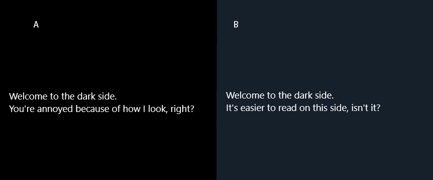
1.Use True Black vs. Dark Gray Carefully
Pure black backgrounds (#000000) are excellent for saving battery on OLED screens, but they can feel harsh on the eyes. That’s why many leading apps use dark gray tones (#121212 or similar), which offer a softer visual experience while still appearing sleek and modern.
2. Maintain Visual Hierarchy
Depth, spacing, and shadows don’t disappear in dark mode—they just need to be adjusted. Use subtle shadows or lighter border strokes to separate components and maintain layout clarity. Without a proper hierarchy, your UI can appear flat and confusing.
3. Use Accent Colors Sparingly
On a dark background, colors appear more vibrant, sometimes overwhelmingly so. Choose accent colors that complement your brand but use them strategically for actions, highlights, and active states. Overuse can make the interface visually noisy.
4. Ensure Readable Text Contrast
Text visibility is critical in dark mode. Avoid pure white text (#FFFFFF), as it creates excessive contrast and eye strain. Instead, use off-white or light gray shades. Follow WCAG guidelines and aim for a minimum contrast ratio of 4.5:1 to ensure readability across all devices.
5. Design With Both Modes in Mind
Design dark mode in parallel with your light theme to maintain consistency. iOS and Android both offer system-level support for dark mode, so your app should respect user preferences. Consistent theming prevents design drift and reduces dev time later.
- Want Expert Feedback on Your UI?
- Let our design team review your current UI and suggest improvements. No pressure, no commitment.
- Book Custom UX Audit Now!
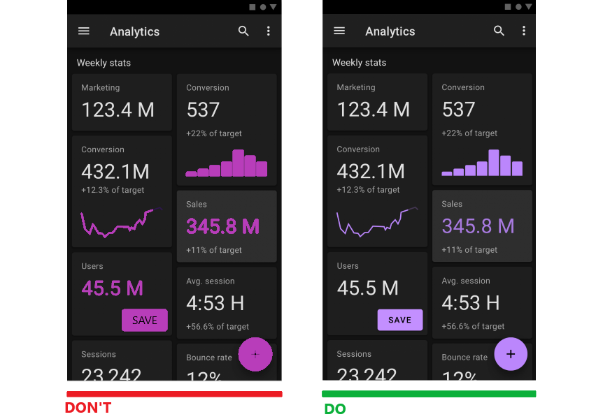
How To Avoid An Unhealthy Dark Mode?
Dark mode isn’t a standalone feature—it should fit into your app’s overall design system and UX logic. A poorly designed dark mode can do more harm than good, causing eye strain, hurting readability, and even pushing users to switch back to light mode.
To avoid this, understand common mobile app design patterns and implement dark mode in a way that feels intuitive, consistent, and aligned with user expectations.
Best Practices to Avoid Unhealthy Dark Mode UI
- Avoid Pure Black and White: Extreme contrast between #000000 and #FFFFFF can cause visual fatigue. Use softer shades like dark gray for backgrounds and off-white for text.
- Maintain Proper Contrast Ratios: Stick to WCAG guidelines (4.5:1 for body text) to ensure readability across all devices and lighting conditions.
- Limit Saturated Colors: Bright colors pop more against dark backgrounds, but too much can be overwhelming. Use accent colors sparingly and with purpose.
- Test in Real Environments: Preview your app in low-light settings and on different devices to see how it feels to users.
- Respect User Preferences: Always provide the option to toggle between light and dark modes. Don’t force dark mode as the default.
Tip: Poor implementation often comes from not designing both light and dark modes together. Building them in parallel helps avoid design mismatches and usability gaps.
Why You Should Design Dark Mode App with TekRevol
Building a dark mode that works for your users isn’t just about flipping colors. It takes thoughtful design, accessibility, and consistency across platforms.
That’s where TekRevol comes in – one of the top web design companies in the USA, known for delivering visually stunning, user-friendly digital products.
We help brands design dark mode experiences that look great, feel natural, and improve usability—whether you’re launching a new mobile app or upgrading an existing one.
Our web development services cover everything from UI design to full-stack architecture. You’ll get:
- A team that understands iOS and Android system guidelines
- Designs tailored for comfort, readability, and performance
- A process that moves fast, without compromising quality
- Ready to Elevate Your App’s UX?
- Let’s design a dark mode experience your users will love.
- Get Free Design Consultation Now!


